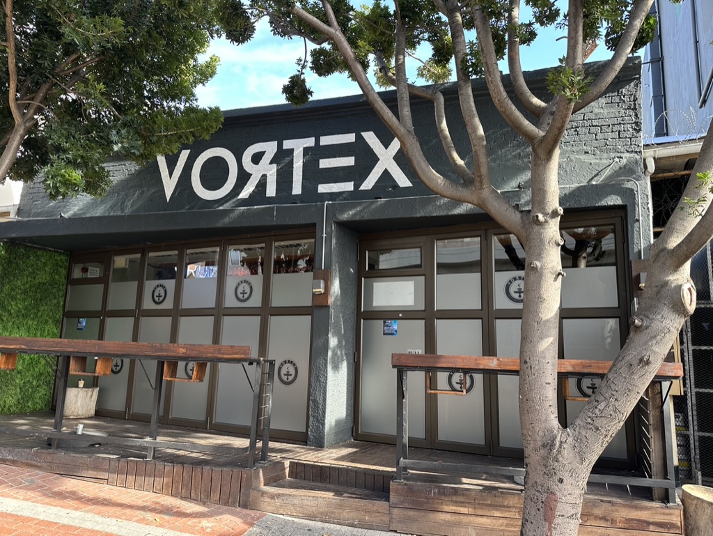
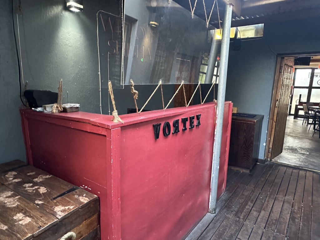
Let’s take a look at the brand and design features of the Vortex concept. There are various elements of the design which will be considered as ‘critical’ elements, and non negotiable in the design to align consistency of the brand, and other may be optional or used in part based on the potential location size and layout. These aspects would be reviewed, discussed and planned during the design phase of the project.
Main Area
The main area is the key focal point of Vortex, and in some design layouts may be the only area, and if this is the case we will attempt to create some different ‘zones’ to show a differing look and feel.
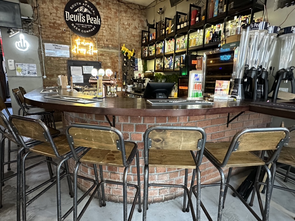


The main area includes the majority of the seating in a variety of styles, with larger sharing tables and benches, seats for 4 with built in shisha holders into the table, and bar seating areas around the bar which should also be a focal point of the main area showing the full display of available drink offerings. Tables and seating are of a timber and metal design, with durability being the key priority in style and design.
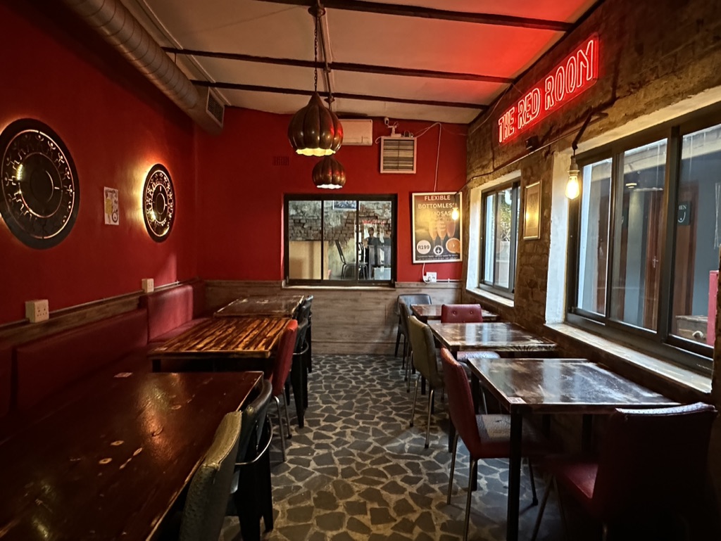
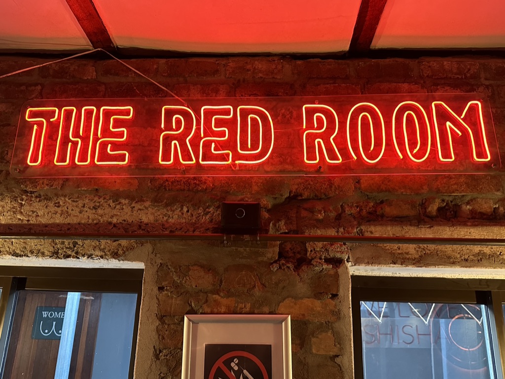
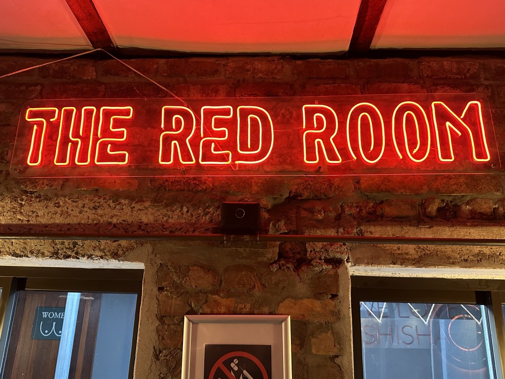
The Red Room
As the name suggests, this is a seperate and segregated area which can be closed of from the main area to not be as loud or congested as the main area. This area is often used during the day by remote workers, or for couples to come and chill, or for seperate event based large group customers. This room has it’s own neon sign branding – The Red Room (which is a key critical element if a Red Room can be established).

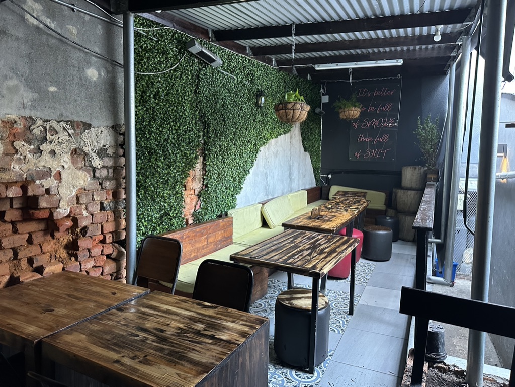
Outdoor areas
Our Kloof St location is fortunate to have two distinct outdoor areas – one at the front of the premises as a deck overlooking Table Mountain and a larger undercover area out the rear of the building. This offers us another area for customers who don’t want the noise of inside, yet can enjoy their food or shisha in a quieter area, and still have big screen tv access to live sport or other entertainment etc.


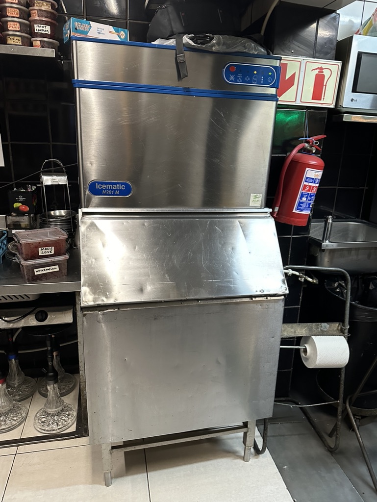
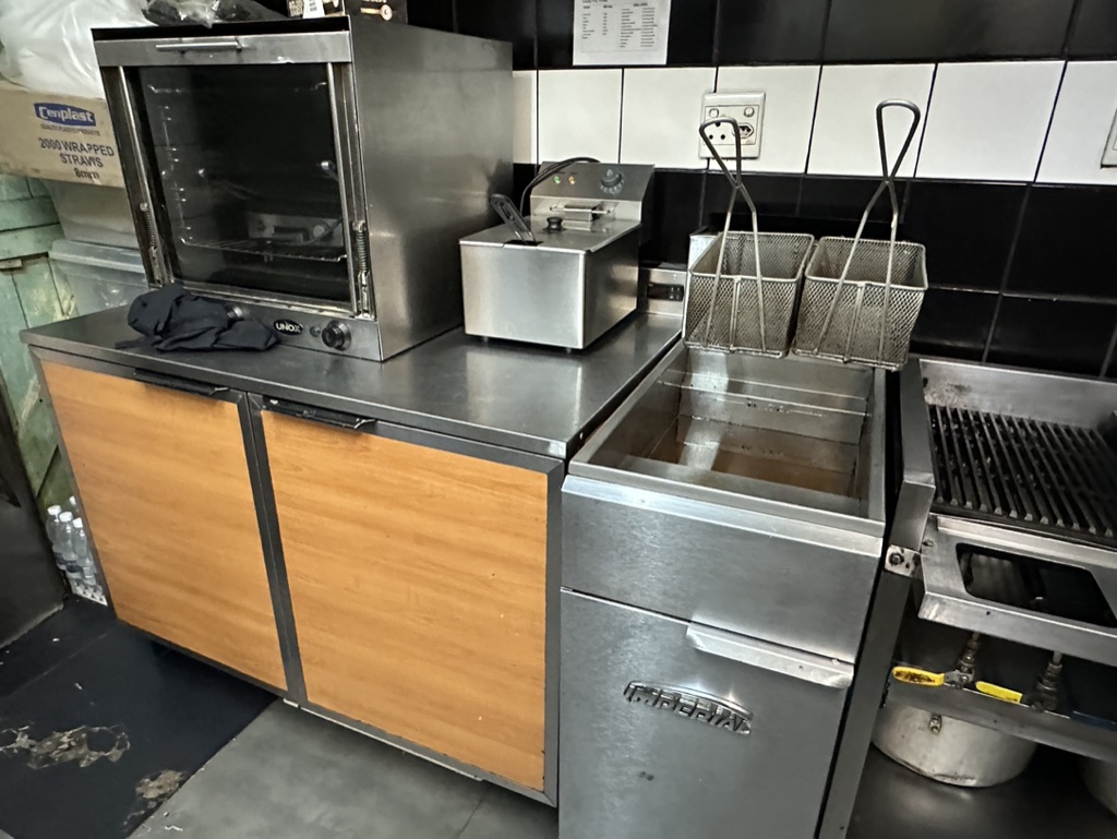
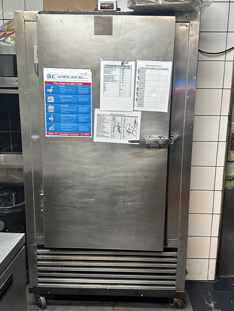
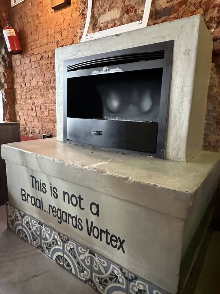
The Kitchen
Vortex Kloof has a fully operational kitchen, therefore can offer a more extensive menu, such as grilled items, burgers, pizzas etc as well as basic starter type options of various fried items. Whilst this is an advantage, the basic minimum would be to have a set up with starter items on offer, which would reduce the operational and equipment needs, but clearly if space and layout suits, we would suggest a more functional kitchen to enhance the food based offering.


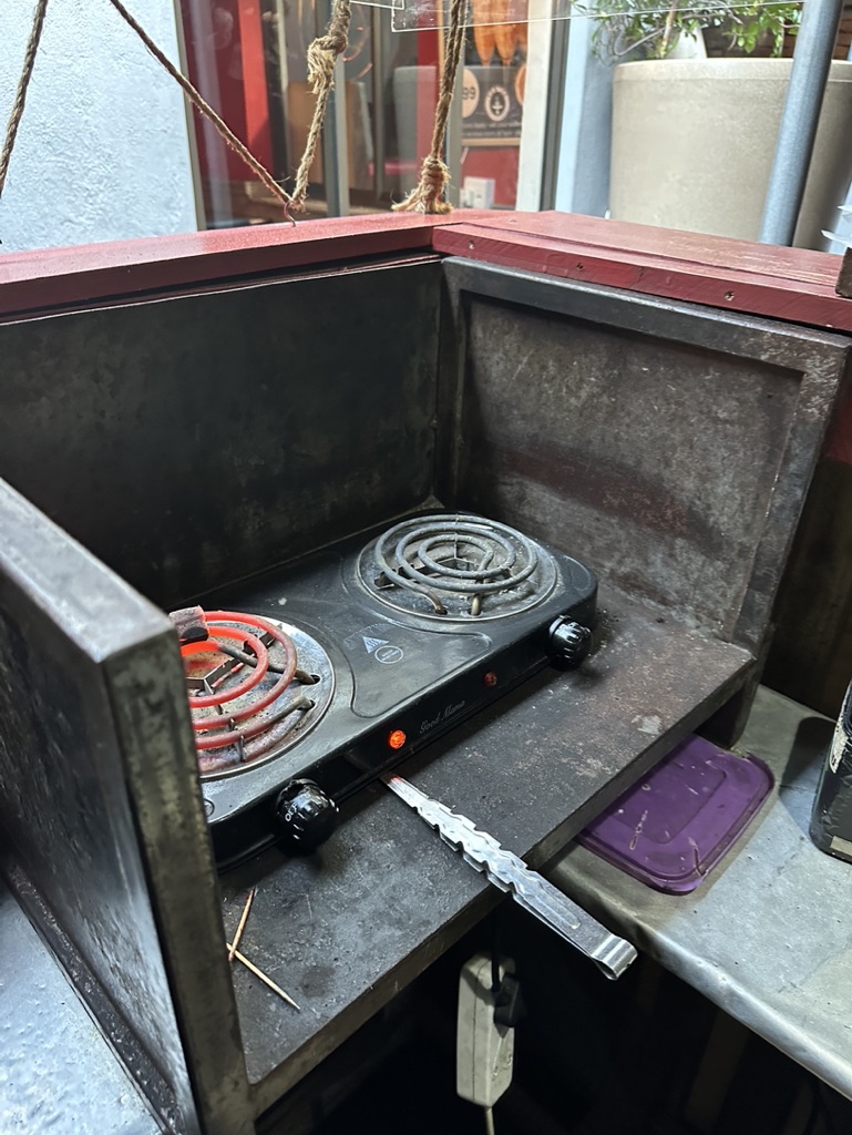
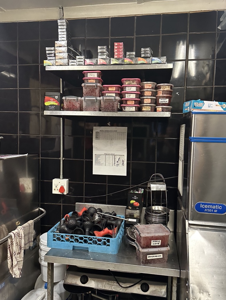
Shisha Preparation area
Our shisha preparation area has been located outside the building in an undercover all weather location. This ensures that shisha is totally seperate to food/ kitchen prep and allows for a dedicated space to prepare the best pipes around.
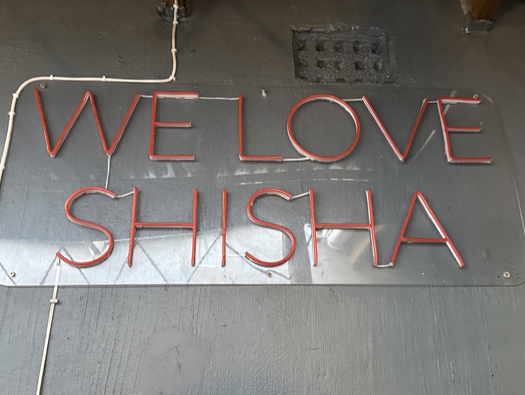
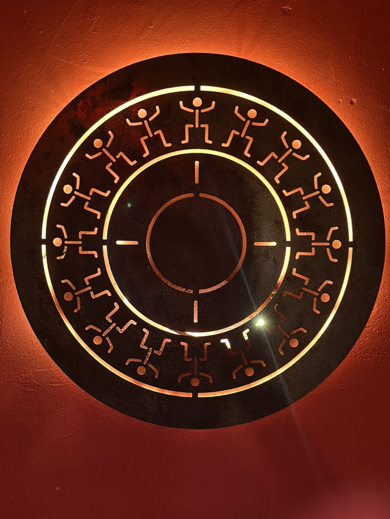
Signage
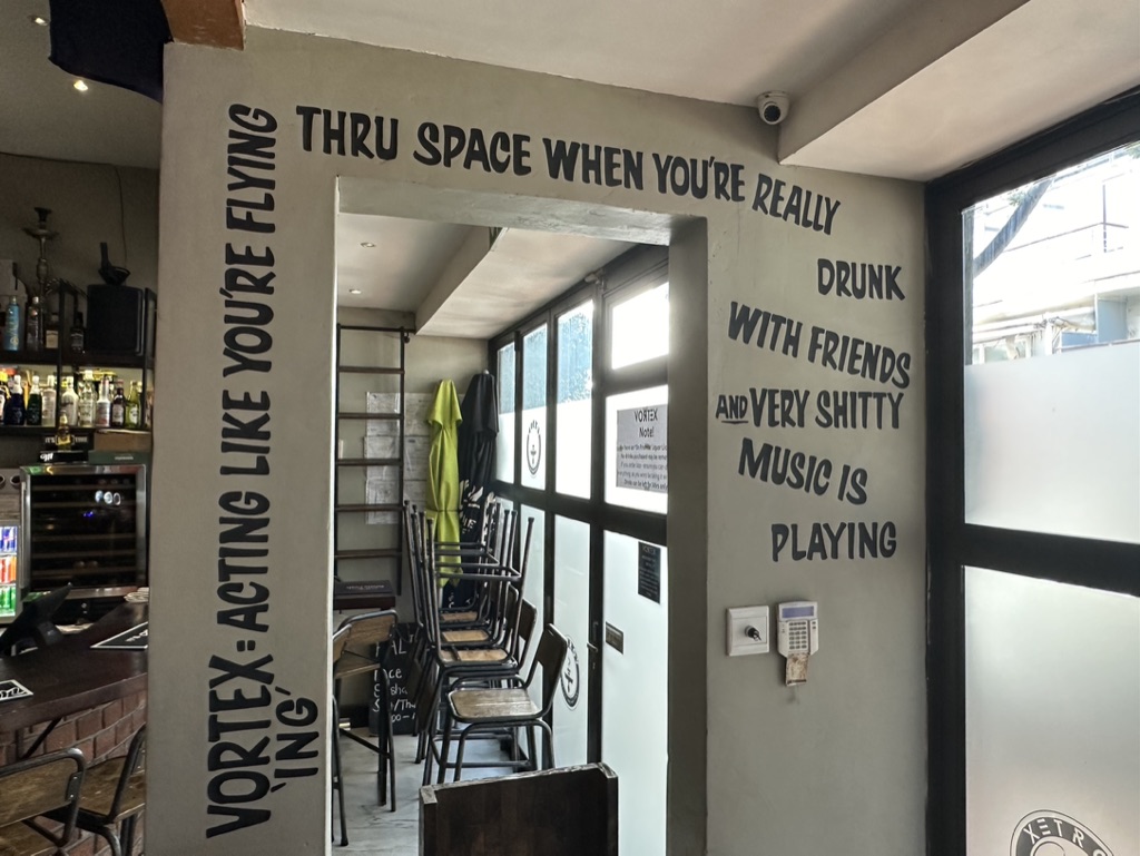
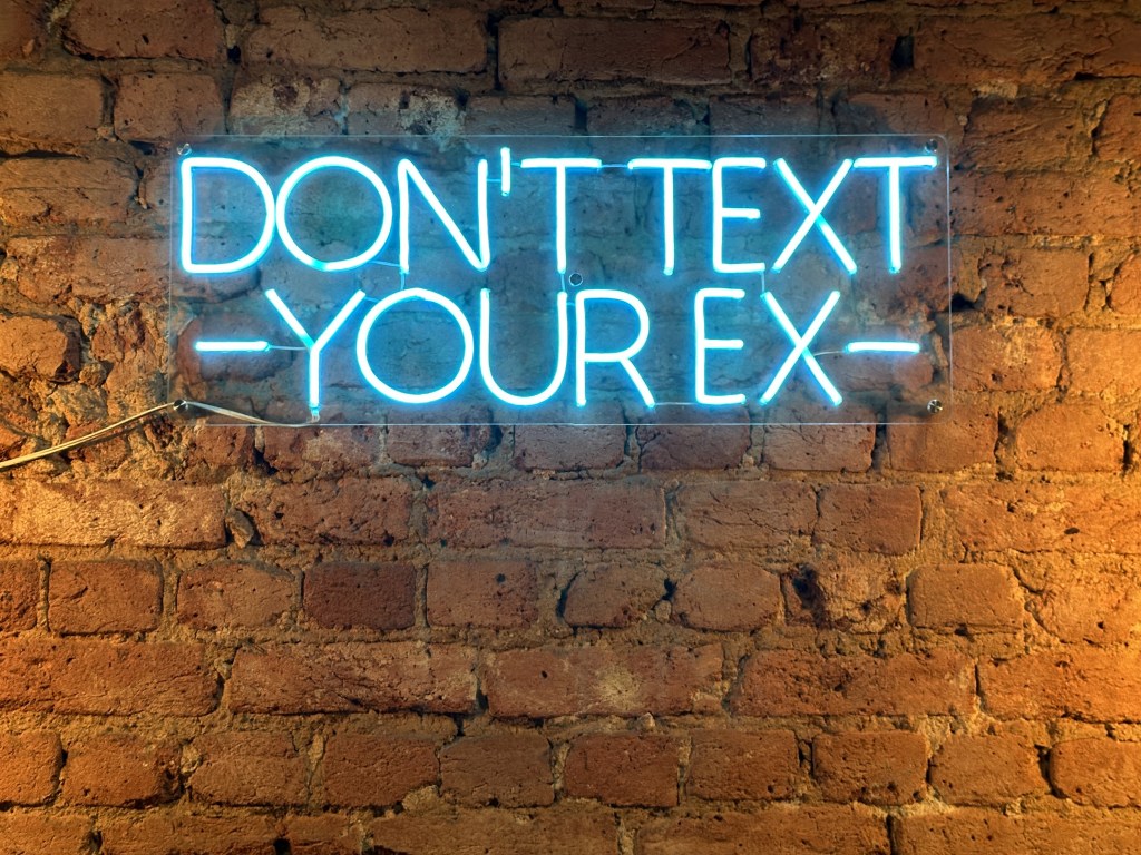
One of key brand elements are the neon sign range and options which exist within Vortex along with painted quotes, around various key locations, on walls, plus location identity signs on doorways etc.
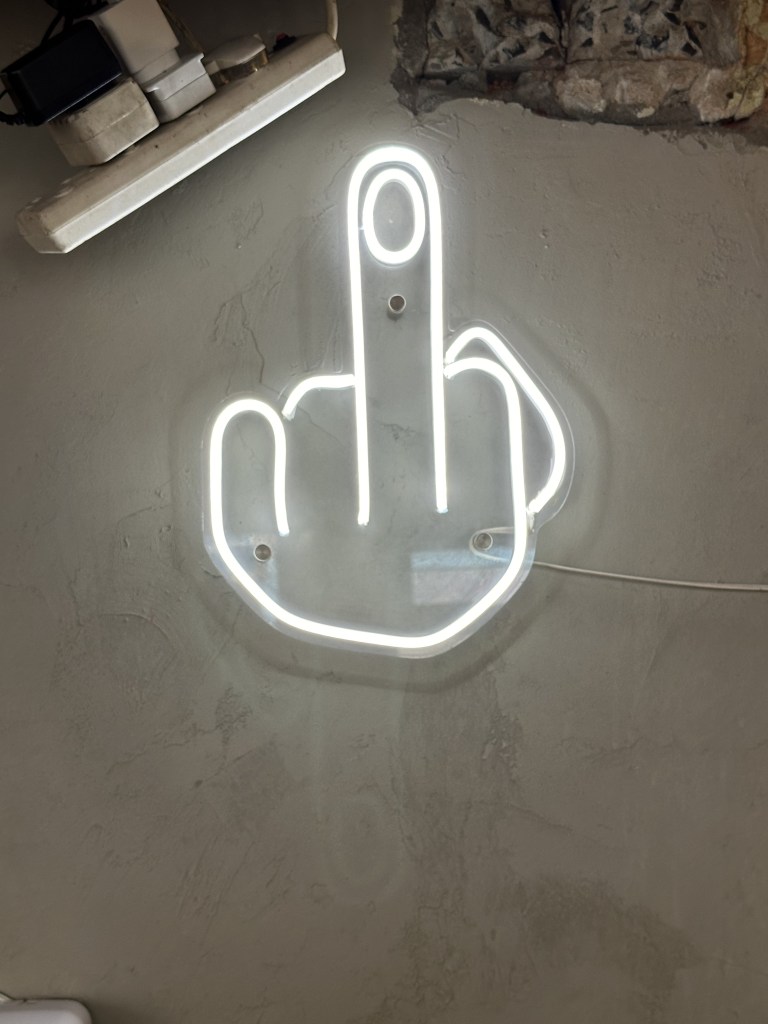
Key compulsory critical elements include:
“What happens in Vortex, stays in Vortex”
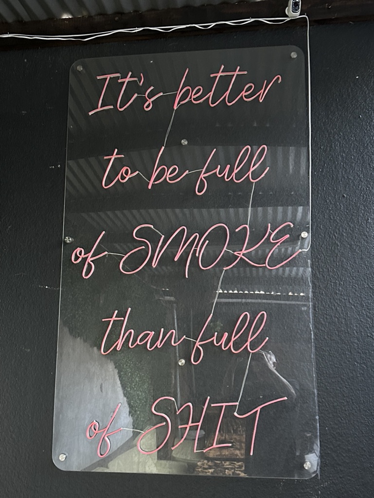
“It’s better to be full of smoke, than full of shit”
“Don’t text your ex”
The middle finger!
“It’s always Happy Hour” at the bar
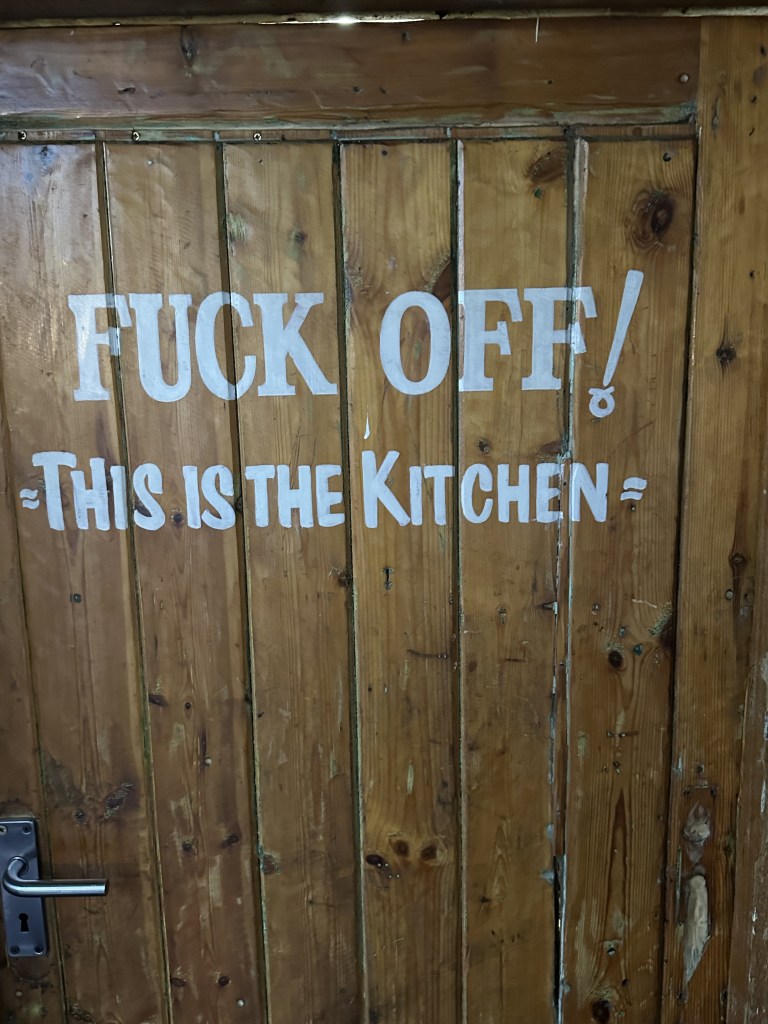
“I licked it so it’s mine” (if a kitchen is in operation)


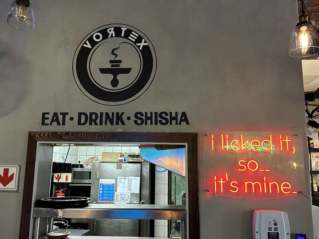
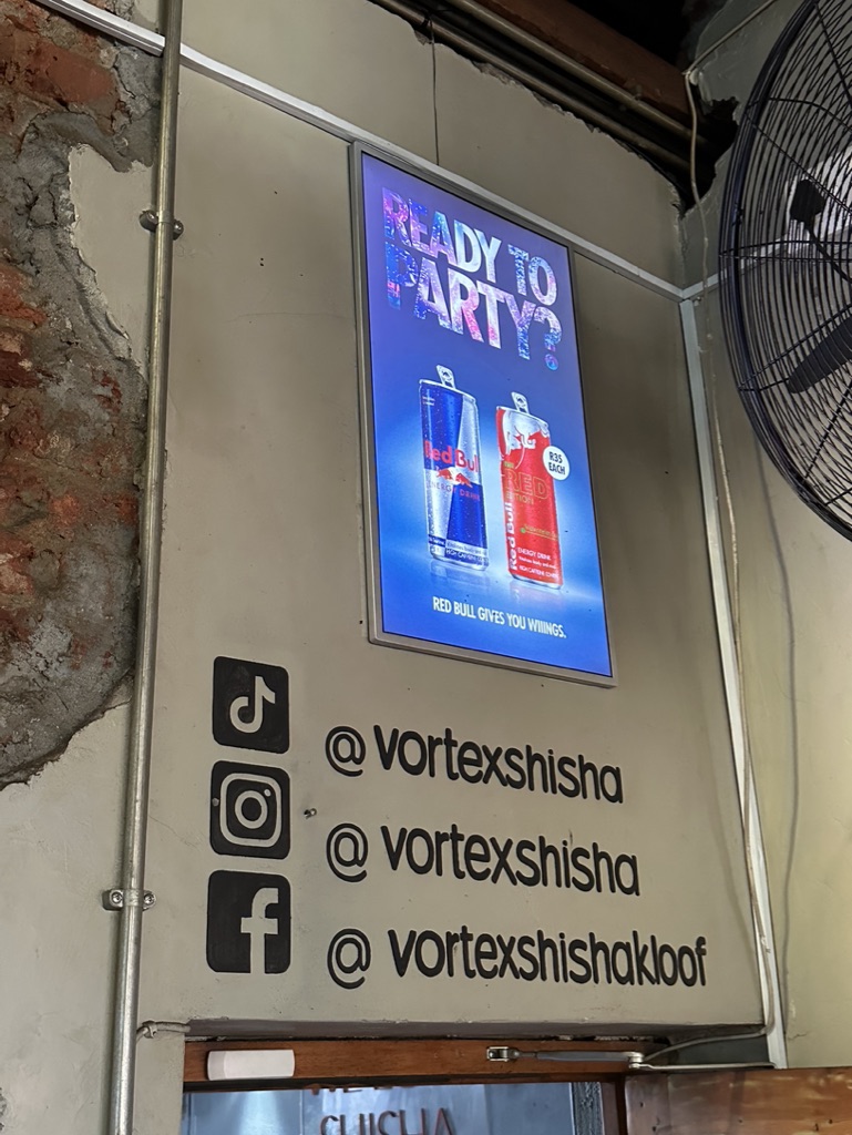


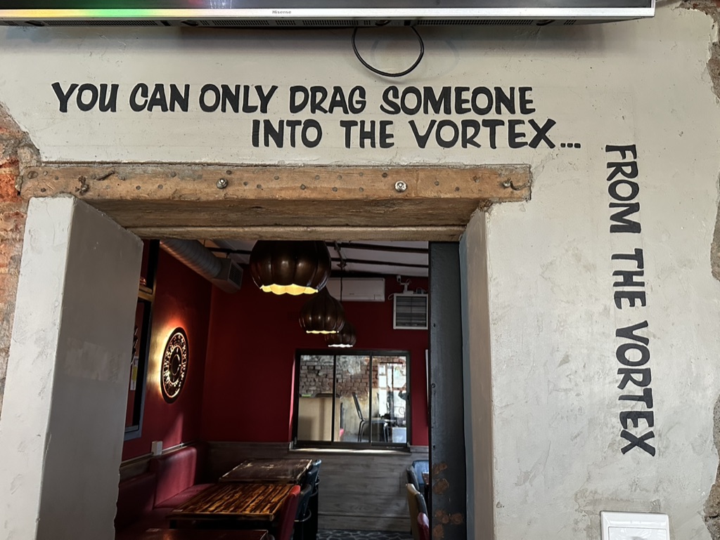
Painted signs of Social Media tags and our Round logo with EAT DRINK SHISHA are also critical elements, with the balance being optional based on design criteria, but if they can be accommodated without cramping wall space, they will be.
In addition, at least 2 x A1 Poster holder frames are to be added to the main area for promotional advertising purposes.
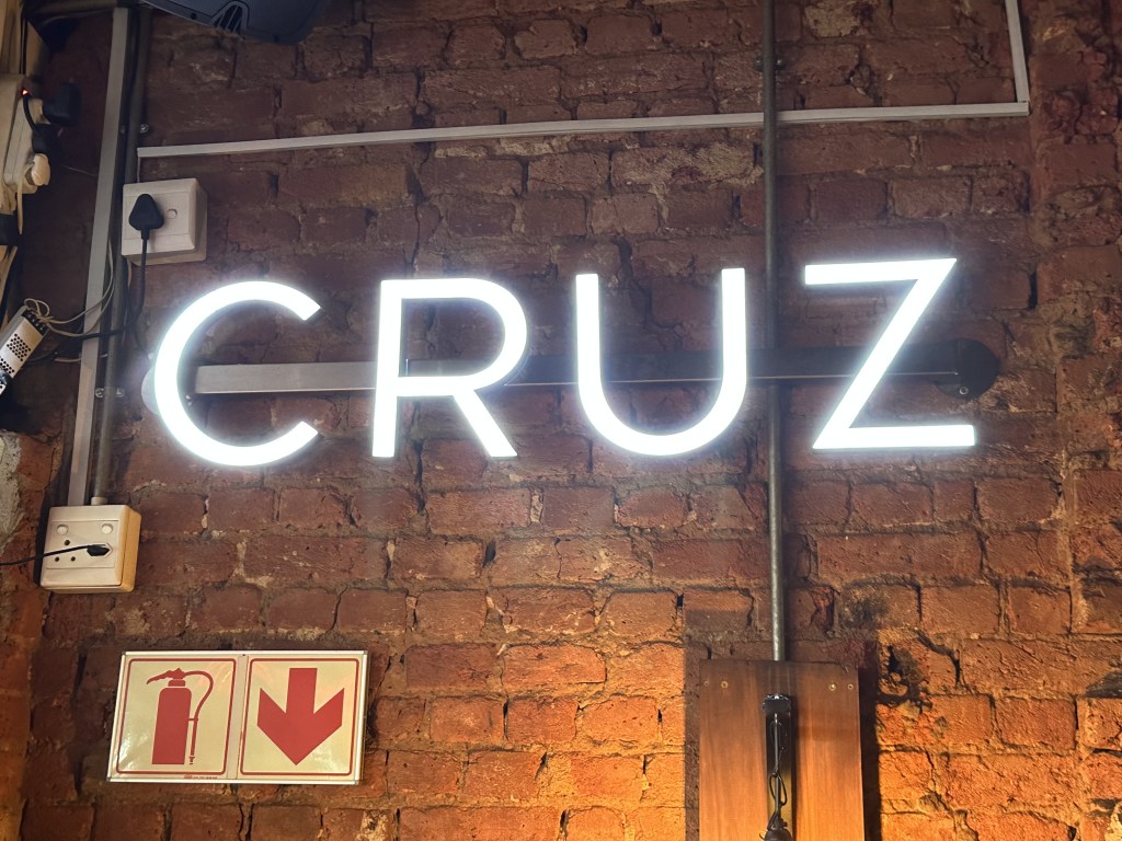
*Note – some of the signs are supplied free of charge from other suppliers i.e Red Bull, Devils Peak, Cruz, Smirnoff, Heineken etc. These come via relationships with vendor representatives.
